Outbank
Outbank 2.0 for iOS
2017 – 2018
Creating a Design System that works for everybody
Redesigning Outbank for iOS
After launching the new Outbank in June 2016 and 1.5 years of fast paced feature implementation and brand evolution the pain points of the design language and development processes were clear. The team knew that we needed a flexible and open design system that was easy-to-implement by the developers.
Client: New and existing Outbank users on iOS; the Outbank team
Timeframe: October 2017 - February 2018
Goals
Increase legibility/usability
Easy-to-implement design language
Future-proof navigational structure
Platform consistency
Problems
Since the relaunch of Outbank in June 2016 the team had implemented new features at a fast pace, releasing a new version of the app as often as every two to three weeks. In the meantime the design language established for the relaunch existed mostly of custom UI and fonts, making it hard for developers to implement new features at such a speed. We had also gathered a lot of feedback from our users over the time, making it clear that readability and contrasts had to be improved. Additionally the current navigational structure via a hamburger menu didn't allow us to add more important functionality to the app while keeping it simple to use and discover new features.
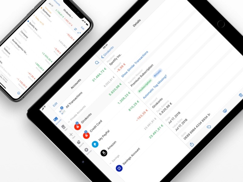
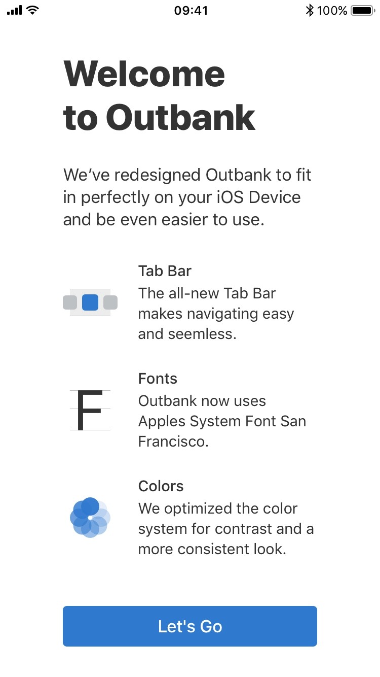
The Tab Bar
The first major effort for Outbank 2.0 I undertook was the new navigational structure. After gathering the current status of the app and working through a couple of wireframes I designed the Tab Bar for Outbank on the iPhone and iPad.
Read more about the Tab Bar here.
Creating the Design System
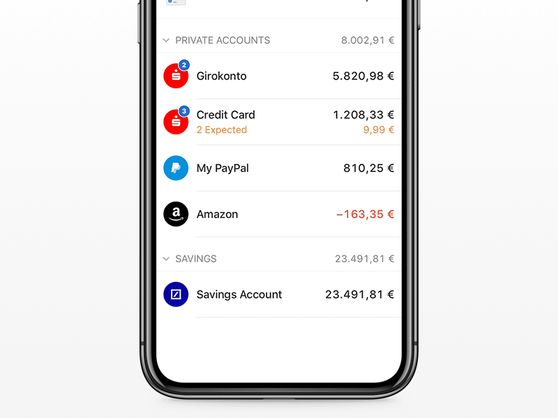
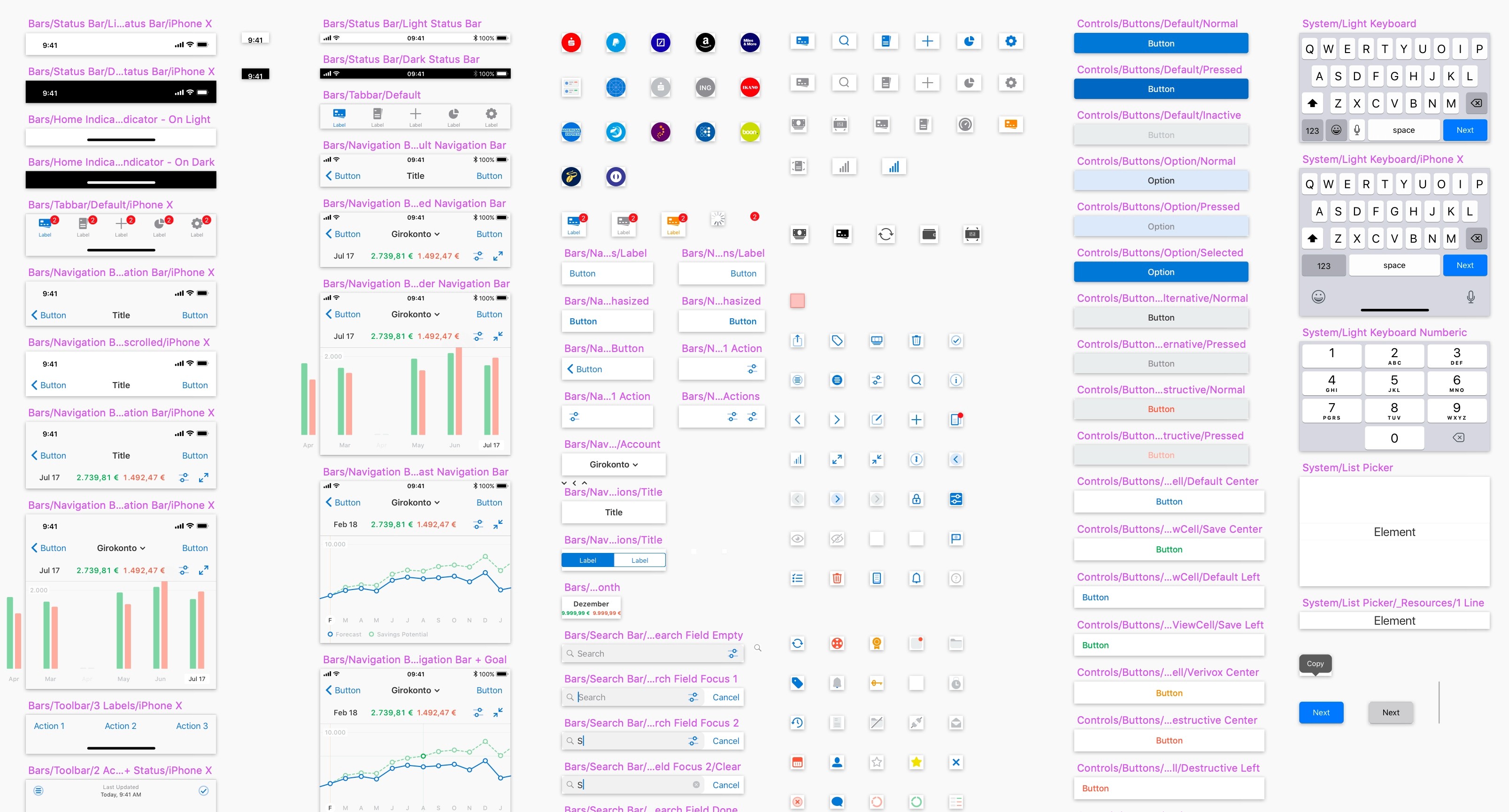
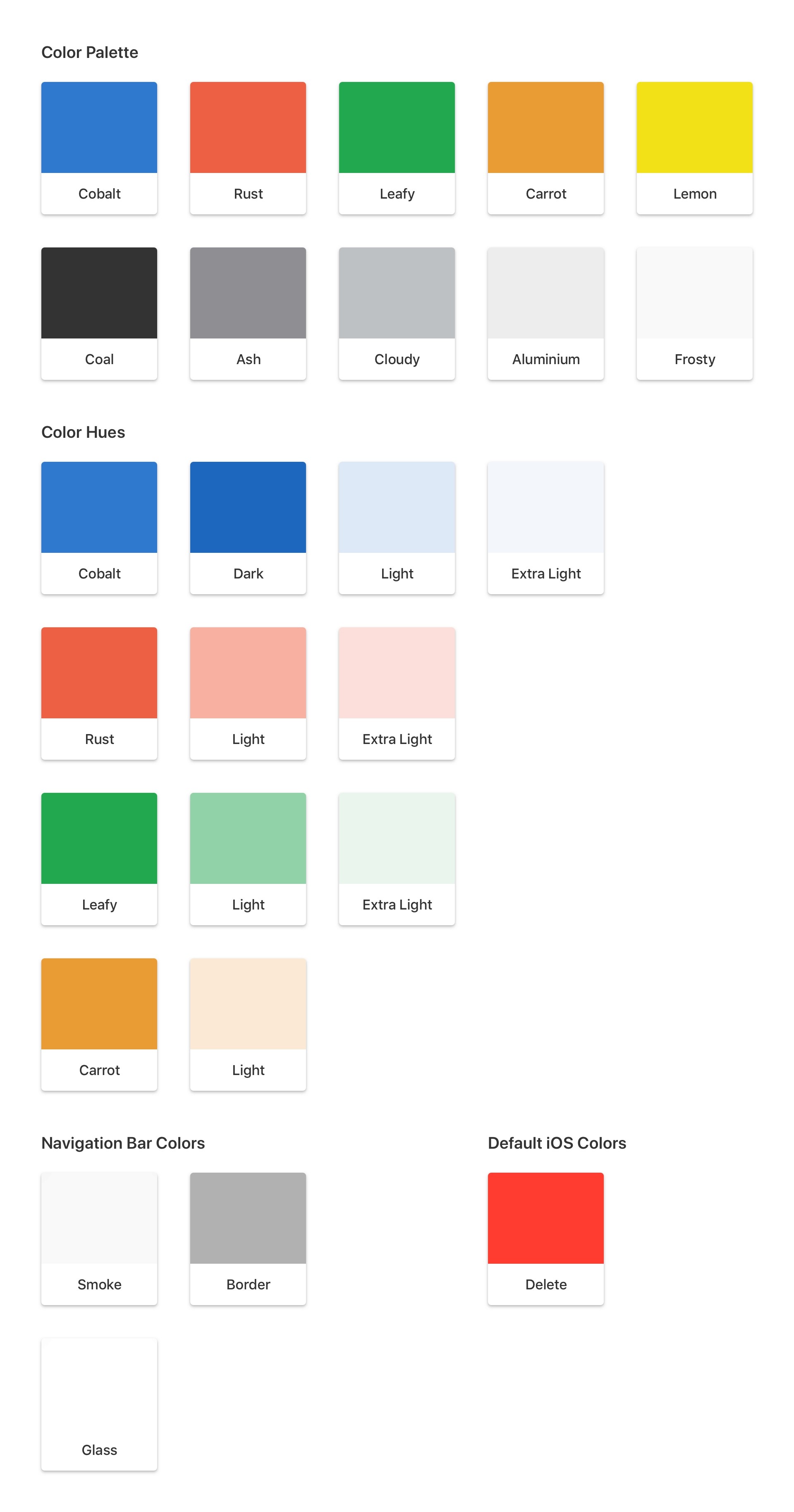
Going into this redesign I knew that one of it's most important goals was easy-implementation for future development. The design system I created therefore was heavily based on default iOS design elements. Only buttons, icons, colors and a few custom elements would be able to be brand-aligned and step out of the iOS Human Interface Guidelines. As a multi-banking app Outbank consists mostly of tableviews including lots of numbers, so I kept any cell and table as close to default as possible. While creating all of the necessary elements I kept in touch closely with our team of developers and QA trying to end up with a library of elements that could be repeatedly used to create new features, worked beautifully for our users and could easily be implemented at our fast schedule.
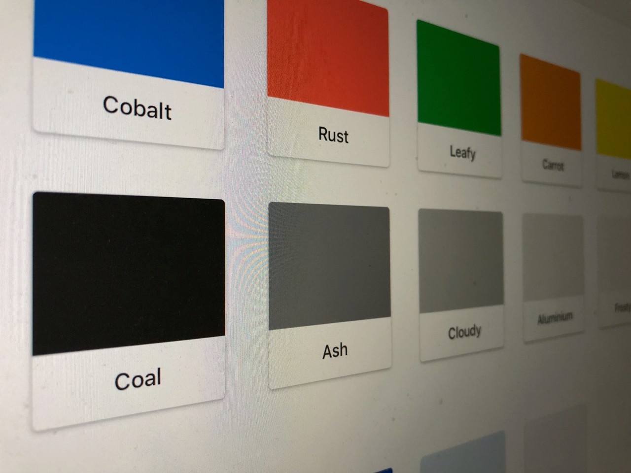
The Color Scheme
Outbank previously featured a very light and low contrast shade of blue, which was replaced by Cobalt, the new main branding color. Cobalt is a bold and saturated color that makes interactive user interface elements easy to find while not distracting the user from their finances. The new blue was also my starting point to redefine the rest of the color system. I established a more serious and contrasty shade of green to make positive amounts more legible. All colors were updated to fit into the new palette.
Switching to a System Font
The update to 2.0 also brought San Francisco to Outbank, Apples System Font. Previously the app was set in Avenir, which never felt completely at home on the platform. I made the typography in the app bolder and larger, which makes things easier to read and establishes a clearer hierarchy. Every single line of text in the app was carefully considered to craft a consistent experience. San Francisco also comes with a couple of nice features right out of the box, for example Monospaced Numbers. All the amounts and numbers in the app were now set monospaced, which means that amounts in a table can be compared faster and more easily as their length doesn’t change.
Results
When we launched Outbank 2.0 for iOS we couldn't have been more proud, and our users agreed. The redesign was welcomed positively and we got lot's of feedback approving our efforts for navigation and accessibility. For the team we established a design system that fit our needs and we were able to implement features much more smoothly from that point on. Nothing is is ever done though, so we constantly update and expand these resources over time so they continue to work for our users and for the team.
Credits
Sebastian Metel – UX & UI Designer
Lisa Cali – Product Owner
Ralf Sangl – CTO
Krisztina Csernavölgyi – Head of Support
Anya Schmidt – CEO
Lukas Gramalla – iOS Developer
Fabian Renner – iOS Developer
Tools
Adobe Comp
Sketch
InVision
Principle
Jira
Creating a Design System that works for everybody
Redesigning Outbank for iOS
After launching the new Outbank in June 2016 and 1.5 years of fast paced feature implementation and brand evolution the pain points of the design language and development processes were clear. The team knew that we needed a flexible and open design system that was easy-to-implement by the developers.
Client: New and existing Outbank users on iOS; the Outbank team
Timeframe: October 2017 - February 2018
Goals
Increase legibility/usability
Easy-to-implement design language
Future-proof navigational structure
Platform consistency
Problems
Since the relaunch of Outbank in June 2016 the team had implemented new features at a fast pace, releasing a new version of the app as often as every two to three weeks. In the meantime the design language established for the relaunch existed mostly of custom UI and fonts, making it hard for developers to implement new features at such a speed. We had also gathered a lot of feedback from our users over the time, making it clear that readability and contrasts had to be improved. Additionally the current navigational structure via a hamburger menu didn't allow us to add more important functionality to the app while keeping it simple to use and discover new features.
The Tab Bar
The first major effort for Outbank 2.0 I undertook was the new navigational structure. After gathering the current status of the app and working through a couple of wireframes I designed the Tab Bar for Outbank on the iPhone and iPad.
Read more about the Tab Bar here.
Creating the Design System
Going into this redesign I knew that one of it's most important goals was easy-implementation for future development. The design system I created therefore was heavily based on default iOS design elements. Only buttons, icons, colors and a few custom elements would be able to be brand-aligned and step out of the iOS Human Interface Guidelines. As a multi-banking app Outbank consists mostly of tableviews including lots of numbers, so I kept any cell and table as close to default as possible. While creating all of the necessary elements I kept in touch closely with our team of developers and QA trying to end up with a library of elements that could be repeatedly used to create new features, worked beautifully for our users and could easily be implemented at our fast schedule.
The Color Scheme
Outbank previously featured a very light and low contrast shade of blue, which was replaced by Cobalt, the new main branding color. Cobalt is a bold and saturated color that makes interactive user interface elements easy to find while not distracting the user from their finances. The new blue was also my starting point to redefine the rest of the color system. I established a more serious and contrasty shade of green to make positive amounts more legible. All colors were updated to fit into the new palette.
Switching to a System Font
The update to 2.0 also brought San Francisco to Outbank, Apples System Font. Previously the app was set in Avenir, which never felt completely at home on the platform. I made the typography in the app bolder and larger, which makes things easier to read and establishes a clearer hierarchy. Every single line of text in the app was carefully considered to craft a consistent experience. San Francisco also comes with a couple of nice features right out of the box, for example Monospaced Numbers. All the amounts and numbers in the app were now set monospaced, which means that amounts in a table can be compared faster and more easily as their length doesn’t change.
Results
When we launched Outbank 2.0 for iOS we couldn't have been more proud, and our users agreed. The redesign was welcomed positively and we got lot's of feedback approving our efforts for navigation and accessibility. For the team we established a design system that fit our needs and we were able to implement features much more smoothly from that point on. Nothing is is ever done though, so we constantly update and expand these resources over time so they continue to work for our users and for the team.
Credits
Sebastian Metel – UX & UI Designer
Lisa Cali – Product Owner
Ralf Sangl – CTO
Krisztina Csernavölgyi – Head of Support
Anya Schmidt – CEO
Lukas Gramalla – iOS Developer
Fabian Renner – iOS Developer
Tools
Adobe Comp
Sketch
InVision
Principle
Jira